

Mashvisor Review: Here’s Everything You Need to Know
In 2020, real estate investing is all about the data. Not only getting your hands on the right data, but understanding how to apply it, contextualize it, and interpret it. The top investors can look at the same numbers as everyone else, and come out ahead of the market, while the average investor scratches their head and barely breaks even.
Right now, the breakthrough that the real estate industry’s chasing is an analytic tool that can digest all that data and consistently produce winning, profitable results. One of the first companies to offer their take on this "killer app" is Mashvisor. Using proprietary algorithms, and drawing on various publicly available data, Mashvisor offers traditional rental and Airbnb investment recommendations at the push of a button; their signature claim is that they can replace three months of research with 15 minutes of browsing.
So does it work? We explored Mashvisor's well-reviewed platform and evaluated their investor tools.
Here are our honest findings.
How Good Is Their Neighborhood Analysis?
Mashvisor lets you zoom in on big and small markets alike, dividing them up by neighborhood. This is a very important feature, especially in dense urban markets where home values vary widely from block to block - and Mashvisor seems up to the task.
When you zoom in on a neighborhood, you’re immediately shown important stats like the median home value, the average cost per square foot, cash-on-cash return, average rental income, and various other stats.
This is all great, but where Mashvisor really shines is transparency; they actually let you see the sources of the numbers and, in many cases, click through to the original sources. Anyone who’s dabbled in real estate long enough knows that averages and median prices can be deceiving, as they’re often a midpoint between very expensive properties and lower-priced ones; in many markets, there are few actual properties near the median price. (That’s not to say median price isn’t a useful number; it’s just limited.) Mashvisor avoids this by letting you peek behind the curtain, so to speak.
Mashvisor’s investment tools are geared towards traditional landlords and Airbnb investors, so when you look at a neighborhood, you’ll be able to click on separate tabs for traditional rentals and Airbnbs. Each tab shows you actual traditional and Airbnb data, broken down month-to-month, on cash flow. If you’re looking at the Airbnb tab, you can often click through to the actual postings on Airbnb, to see the place yourself. In the traditional rental tab, average cash flows are broken down by the number of bedrooms.
There’s also a tab that shows recent purchases in the neighborhood, with detailed data about each property. Below that, is a tab where Mashvisor will present the most lucrative investment type in the neighborhood; for example, a three bedroom rented primarily on Airbnb.
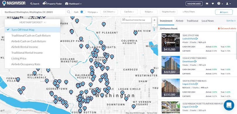
A quick example shows how much data they pack into their evaluations. I looked at Ledroit Park, a hot neighborhood in booming Washington, D.C. Right off the bat, I learned that the median home value was $719,900, and that the average cash-on-cash return was 1.89% for traditional rentals and 2.53% for Airbnb rentals.
To illustrate these numbers, Mashvisor provided dozens of real Airbnb listings in the area, showing how much money they’ve brought in each month for the past year and a half; they also show Airbnb occupancy rates to show seasonal fluctuations— an important consideration for investors that often goes unmentioned.
For traditional rentals, they provided monthly average rents for different types of apartments in the neighborhood, though no specific units were shown. (This is one area where the tool could be improved; as is, it seems as if Mashvisor is nudging users towards Airbnb.)
Below this data, you can graph out cash flows for different types of units and different types of rentals; for users who may prefer visualizations to spreadsheets and tables, this is a really helpful and direct representation, and as you change the parameters of the data— from, say, a one bedroom traditional rental, to a two-bedroom Airbnb— it’s easy to see which investments are lucrative and which aren’t.
Looking at Individual Properties
Mashvisor’s data analytics shine even more when you zoom in on individual properties. Looking at a specific house in D.C., I could see expected rents from both traditional renting and Airbnb, cap rates, cash flows, and expenses. One nice feature: while the default is to use average amounts for each expense, those amounts are adjustable, so you can increase or decrease them depending on your specific situation. You can also add custom expenses, which adds to the site’s "one stop shop" functionality.
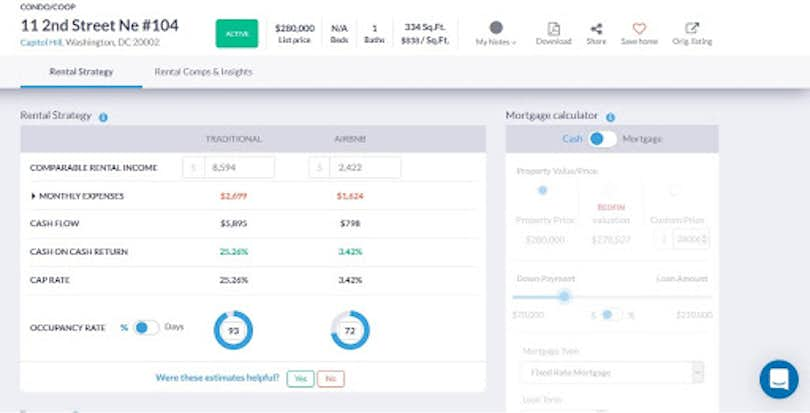
You can also see a graph that shows how long it’ll take you to pay off the property with each type of renting. Again, this kind of data visualization can be really helpful in a way that raw numbers might not be. It’s one thing to see that renting on Airbnb will bring in more money than a traditional rental; it’s another thing to see a graph showing Airbnb income curving steeply upwards while traditional rent looks nearly flat.
Does It Work Both Ways?
Mashvisor works just fine when you want to examine a specific neighborhood or property, but what about investors who have a budget, but no plan beyond that?
Mashvisor offers a "Property Finder" tool that lets you explore properties in different markets based on what kind of investment you’re looking for.
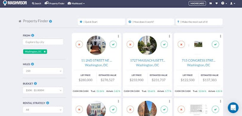
You simply enter your price range, type of investment (traditional vs. Airbnb), number of bedrooms, and any specific markets you’re most interested in. The list that’s produced ranks the properties by potential cash-on-cash return; the top result in my test search for D.C. offered an eyebrow-raising return of 25.26%.
Clicking through gets you a detailed profile, a breakdown of expenses for each rental strategy, and a graph of potential payback timelines based on each rental strategy.
Using the Heatmap
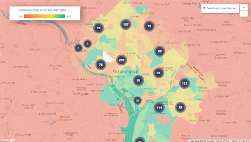
For investors who want to zoom out even more, Mashvisor offers the "Heatmap," which lets you browse an area and see pop-up icons showing how "hot" each neighborhood is for rentals.
The Mashboard
The Mashboard is where Mashvisor all comes together; it’s the homepage for an investor, where you can view your saved properties, leads, and market searches all in one place. Through the Mashboard, you can even search for contact info for property owners, leads, evaluate them for quality, and communicate with them directly through your Mashboard.
The Verdict: Investors, We’ve Found Your Next Investment Tool
There’s a learning curve to using it— though Mashvisor does offer demos and guided tours— but once you get the hang of it, it’s clear you don’t need any other sites or tools. A lot of the research Mashvisor can replace is really just busywork; looking at property listings on one site, calculating returns in a different program, entering the results in a spreadsheet, combing through your contacts for someone’s email address. The fact that Mashvisor integrates all these functions into one page makes it the gold standard for rental investors, and if there’s a better tool out there, we haven’t seen it.